Badger Maps
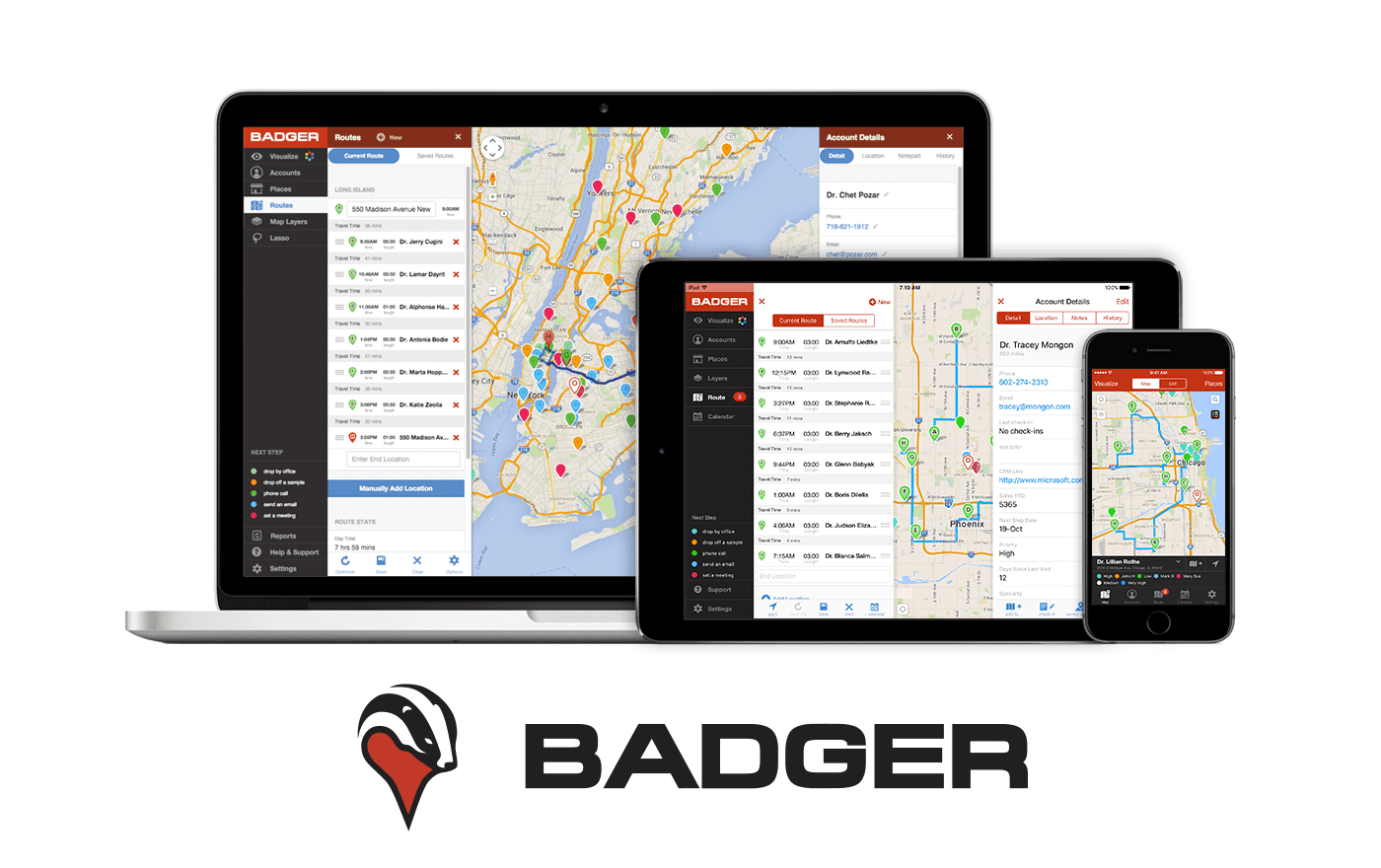
While at Badger, I've had the opportunity to do a little bit of everything. However, my earliest and most tangible contributions have been on design. I'm incredibly proud of how easy to use our product is and how tight the feedback loops are to take action.
Badger is a unique application in that its primary interface is a map. At a high-level Badger works as a light weight CRM for outside sales professionals, so being able to spatially reason with your customers is very important. There are few applications out there that are able to layer data on a map while still making it feel easy to use. Our customers were sales people and had zero patience for an application that felt difficult.
Here I'll breakdown our approach on a platform-by-platform basis.
Responsive Web Application
Designing responsive web applications is absurdly difficult. Do you fluidly adapt? Do you use certain breakpoints? What things do you throw away, and which do you keep? Lets say the core of your experience is a map. How do you keep that map available/surfaceable easily by the user?
I managed to come up with a solution that kept almost all of our templates/components intact while adapting them for mobile at a single breakpoint. Once implemented, it immediately offered a mobile solution across all devices that, while not quite at the level of native, was pretty dang good.
This design has held strong for 4 years, remaining intuitive and allowing us to add features easily.
Let's dig in.
The Metaphor
I wanted a simple structure on desktop that I could easily adapt down to the mobile level.
I decided that there were four things I really had to worry about:
- The Menu
- The Map
- The Menu Details (ie what is exposed when you click on a menu button)
- The Account Details
On desktop, I had the room to have a beefier menu, but on mobile I didn't. So I decided that I'd likely have to toss the menu and recreate it for mobile since the differences would be so stark. However, the rest of it I could re-use if I could wrap my head around it.
I decided to use a 'pane' metaphor, where each pane would be more or less the width of a cell phone. The menu details would be a pane, and the account details would be a pane. This would mean I could re-use the panes on mobile very easily by setting all their element widths to 100% (plus a few other tweaks)
Here's what it looks like on Desktop:
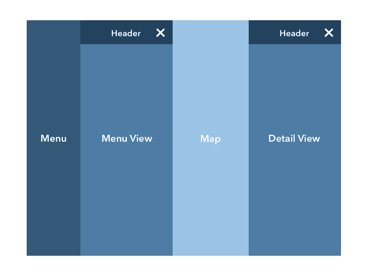
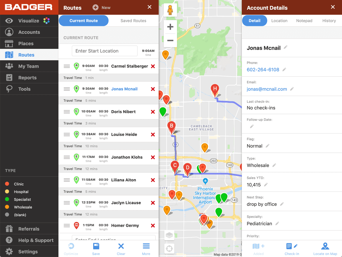
On desktop this is a normal workflow:
- Base State (The map and the menu are the primary interaction mechanisms)
- Menu State (A menu button has been tapped. All menu items are accessible.)
- Detail State (Account detail is being viewed, but menu and menu-detail is still accessible)
And here's how it collapses down for mobile:
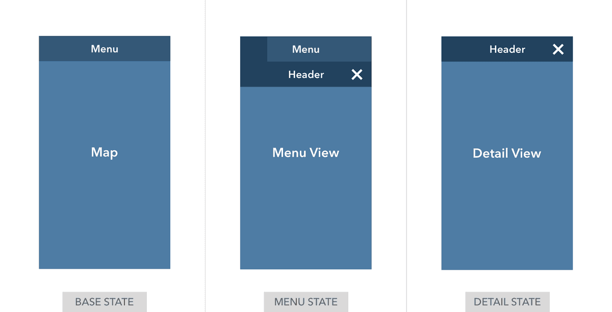
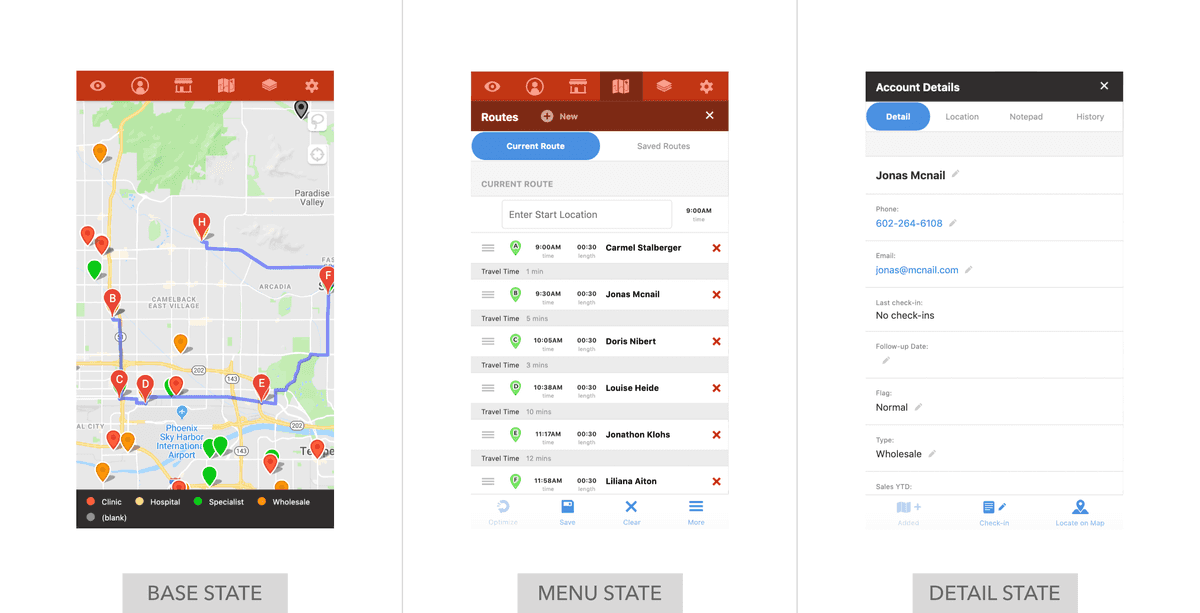
On mobile, things collapse like this:
- Base State (The map and the menu are the primary interaction mechanisms)
- Menu State (A menu button has been tapped. All menu items are still accessible but the map isn't any longer)
- Detail State (Account detail is being viewed, it must be closed before menu is accessible again)
Once I understood the mechanics, collapsing things down to the mobile state via CSS was absurdly simple and the number of tweaks via CSS almost felt too easy.
Webapp Feature Dive
Let's do a quick dive into a single feature just to get a sense of what I was going for with a particular part of the app.
Of all the areas of the app that people interact with, the route list is easily the most complex. There are tons of buttons and things you can adjust. Lets break down all the potential chrome on the route pane:
- Enter start location
- Adjust start time
- Manually re-order route list
- Change an appointment to a fixed time
- Change an appointment's meeting length
- Remove an appointment
- Enter end location
- Optimize the route
- Save the route
- Clear the route
- Add a location to the route from your accounts
- Add a single-use location where you won't need check-ins, etc
- Reverse the route
- Export the route to PDF, Calendar, GPX
PHEW!
But we don't need to do that all at once!
One thing I really wanted to focus on, especially for new users, was creating a single point of entry for the route list. Could we make it so people could just click a single button to access everything they might need?
I think we can.
Let's check out what that looks like in practice:
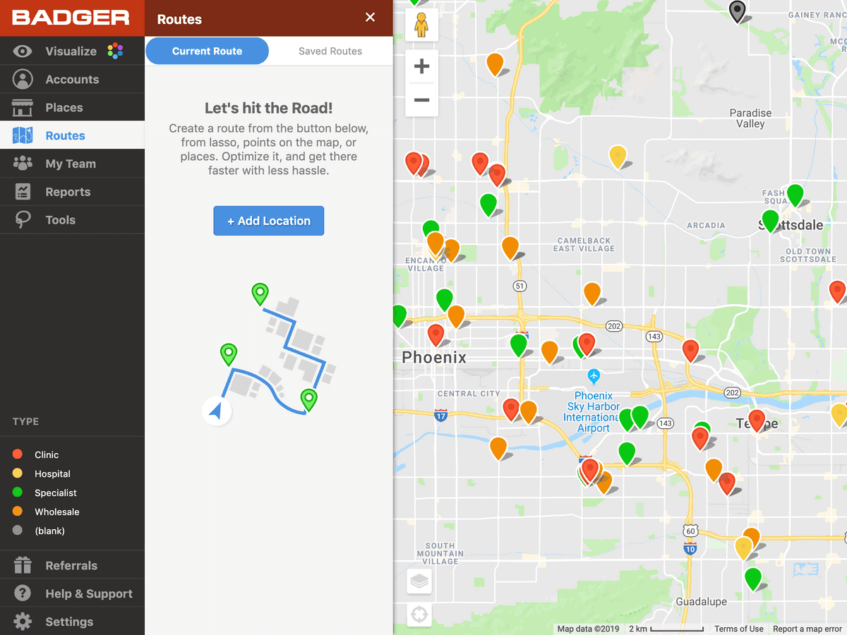
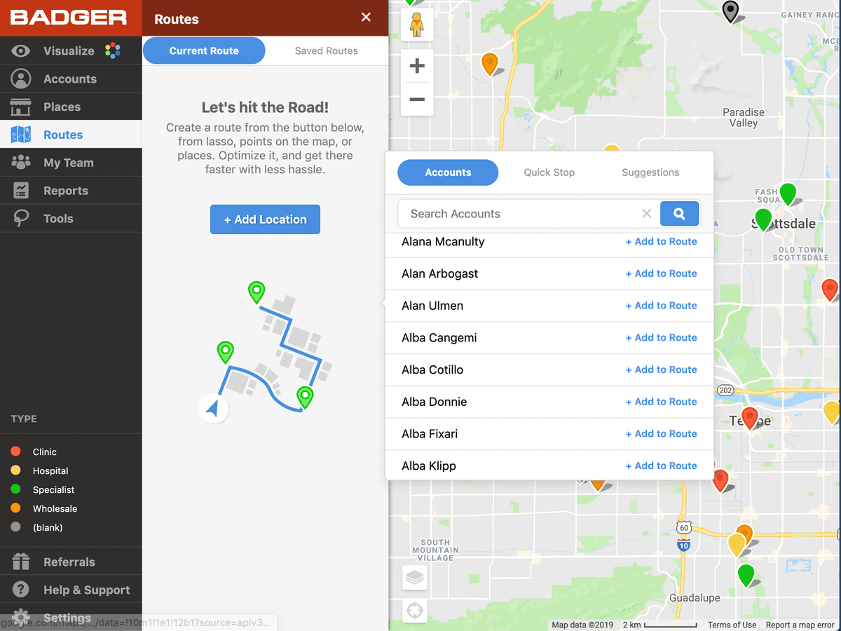
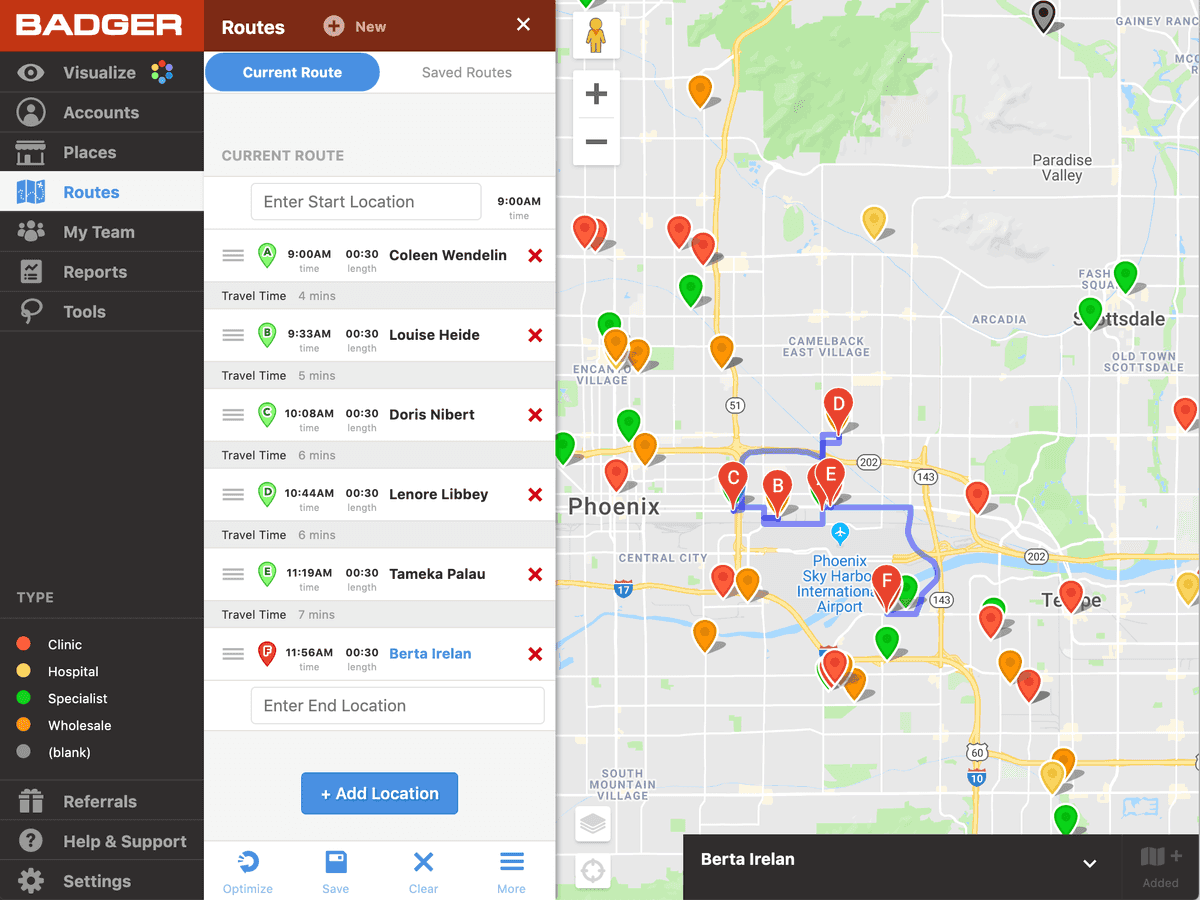
Now, most users might only use a subset of the available features in the route list. But by boiling everything down to a single point of entry, the path forward feels easy and clear. Further, the design is forgiving. Removing, re-adding, and interacting with the route list through a single button is insanely easy and fluid behavior.
Webapp History
Here's an interesting walk down history lane. When we first started, we honestly had no idea what we were building. This category didn't really exist and very few people were building software for outside sales people. You can visually get a sense of how we evolved, slowly understanding the feature sets we'd need.
You can also see me working though the difficulties of designing around a map. Most applications do it poorly, and of all the things I've done at Badger I'm most proud of how we've layered data on top of the map and made it center stage.
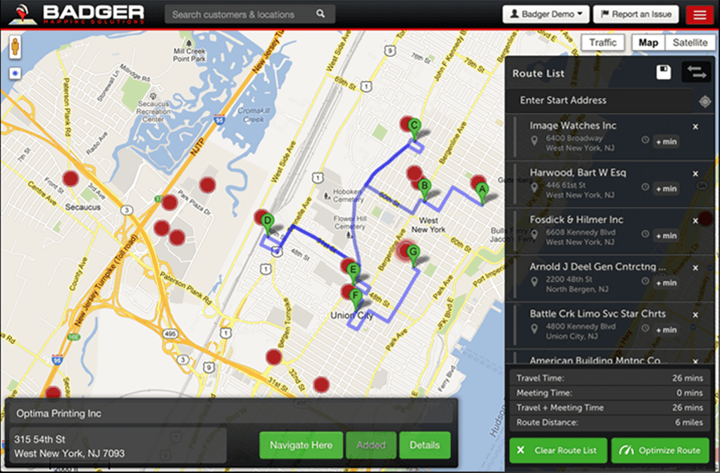 Early designs were meant to rapidly expose features and didn't yet have a strong sense of organization or structure
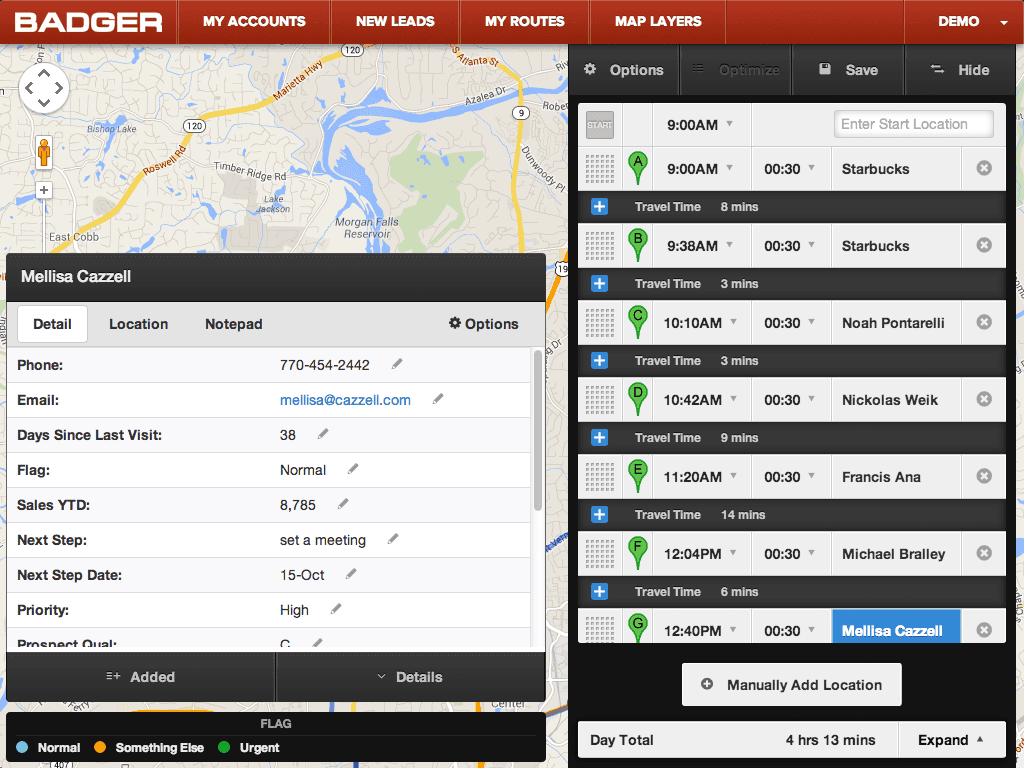 As time permitted, we went back to the original and made it more usable on tablets by increasing touch targets. Time was also taken to solidify the design around brand colors and make the app feel more cohesive.
 When the limits of the original design were reached, I went back to the drawing board and redesigned the app around a 'pane' metaphor, with a menu state on the left and a detail state on the right. This allowed the map to stay front and center.
iOS Application
iOS is our most important client, period. It's been incredible getting feedback and realizing that, given the option, all of our customers would rather never use their computers.
We have thousands of customers using it every day. It brings in a little less than half of our trial signups. It's incredibly important that it be easy to use, bug free, and a pleasant experience.
 The most consequential screens on iOS
Route Mode
Certain screens like route-mode deserve more explanation. When our customers built optimized routes, they almost had an experience of 'now what?'. They didn't know how to actually navigate the route. One of our sales reps said the equivalent of "It would be really nice if there was just some sort of 'GO' button". I felt like that was genius! This was especially true because our app packs in a lot of options, and the route creation screen essentially has the most options of any screen.
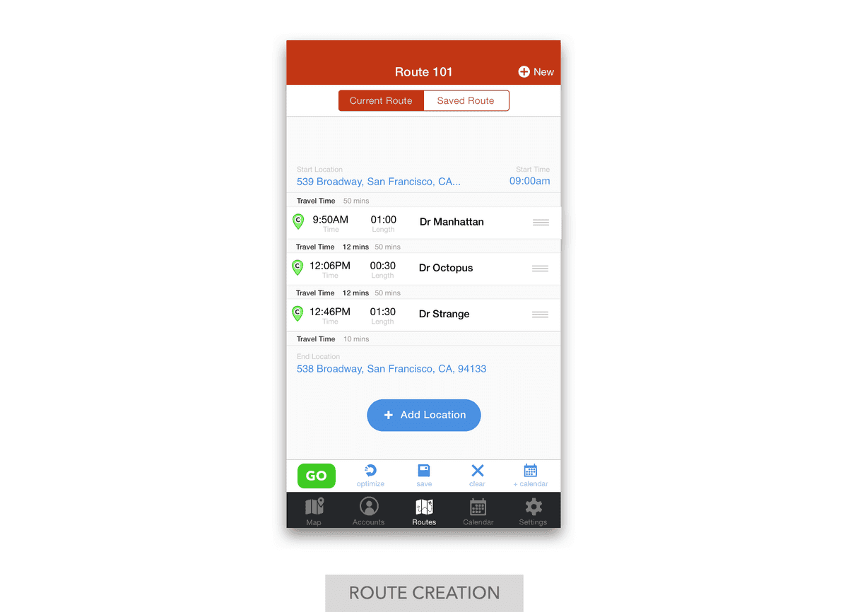
Route mode essentially splits our app in two, conceptually.
- Planning Mode: Where you are finding customers, adding them to a route, optimizing it, and then saving it
- Execution Mode: Where you really just want to execute your route, create check-ins, and navigate
I wanted route mode to feel like a different experience. I wanted to eliminate distractions for the end user. What really mattered when you were done planning?
Not much:
- Viewing account detail
- Creating a check-in
- Navigating to the location
So that's what we did. We put a big GO button below the route you were creating, and when you tapped it the rest of the app fell away.
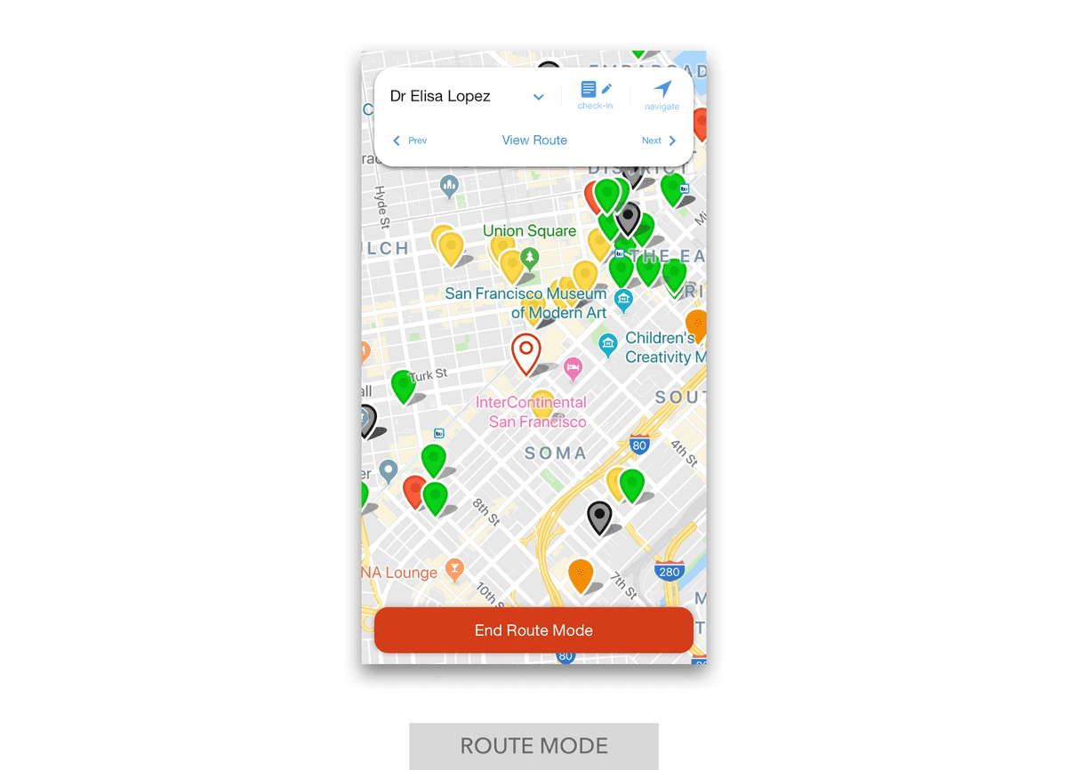 Once you're in route mode, everything else melts away
It makes the app feel obvious, helpful, and a pleasure to use. This was such a big deal that, before we built a native app for Android and we had users switch from iOS to Android, they complained loudly about the lack of 'route mode'.
History
Just some fun history here. When I originally designed the iOS app we were pre-iOS 7, which means that things hadn't flattened out yet. The heavy use of gradients kinda gives it away.
The original assumptions were made on an iPhone 4 (maybe 4s??), where screen real-estate was extremely limited. This led to a lot of companies, including ours, hiding other views behind a hamburger/menu button. Luckily, future generations of the iPhone increased screen real-estate substantially and allowed designers to add the tab-bar back in, increasing usability enormously.
You can also see a transition from using purchased stock icons to custom icons that I made for iOS.
Another couple interesting things to note here:
- Stock icons in earlier versions vs a custom set I designed
- We didn't even have our core value proposition in the first version! A major customer who was paying for us to build the iPhone client really just wanted check-ins to their accounts and didn't care about route optimization.
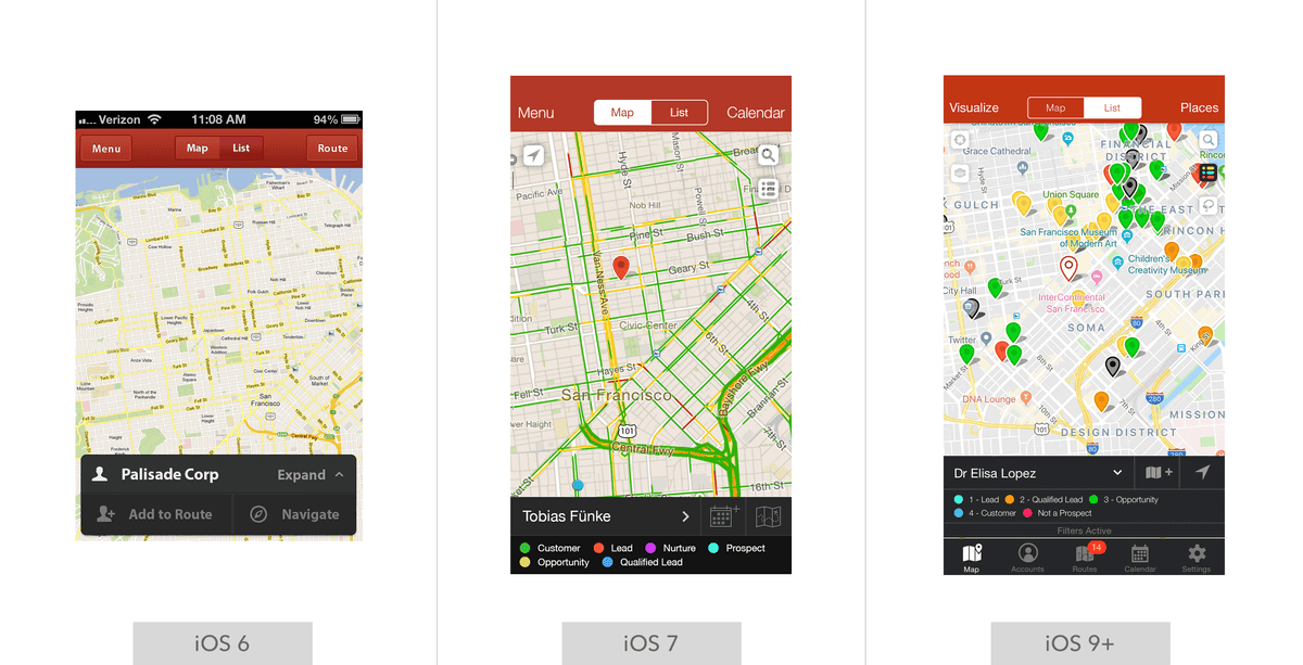 Our iOS app through the sands of time (or iOS versions, if you will)
Android
Android was developed much, much later (as in, perhaps 3 years after iOS).
There were a few reasons for this:
- Most of our customers are in the US, and a vast majority of the US market that is willing to spend money on an application like ours will buy an iPhone.
- We had a responsive webapp that made it so we had at least some sort of solution for Android. Yes, it was a web wrapper. No, it was not great. But it was decent, and it worked well enough.
 Our primary Android screens
Eventually, we had larger team customers come knocking that demanded feature parity with iOS and we got to work.
Design Differences
While I would love to say that Android offered a greenfield project where I could be as creative as I'd like, there were certain realities that I was beholden to. Namely, we wanted team customers with a mix of iPhone and Android to be able to learn from each other and ask each other questions. We also wanted to reduce the burden on our support and sales teams in terms of training and troubleshooting. If everything was almost the same, you could guide someone through the app using your own device without any issues.
Really the project was more about wrapping my head around the norms of material design, and seeing if I could map it to iOS in a pretty clean way. It turned out in the last year or two that material design had thrown in the towel on tab-bars and realized they were huge for usability.
What does this mean for you, the reader? Essentially, it's very difficult to tell the two applications apart. They use the same workflows, the same icons, and the same structure.
Visually though? Here are some good side-by-side examples:
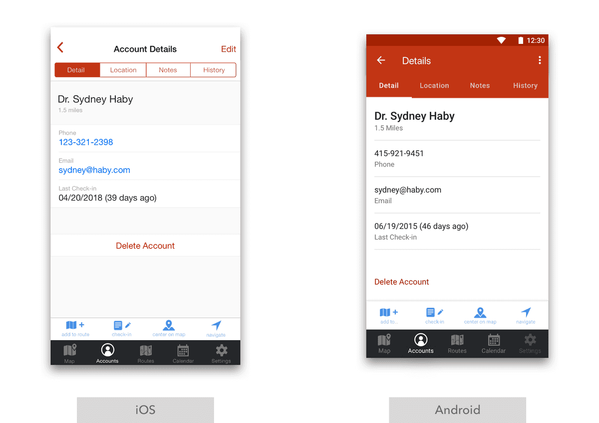 Differences between the account detail screens
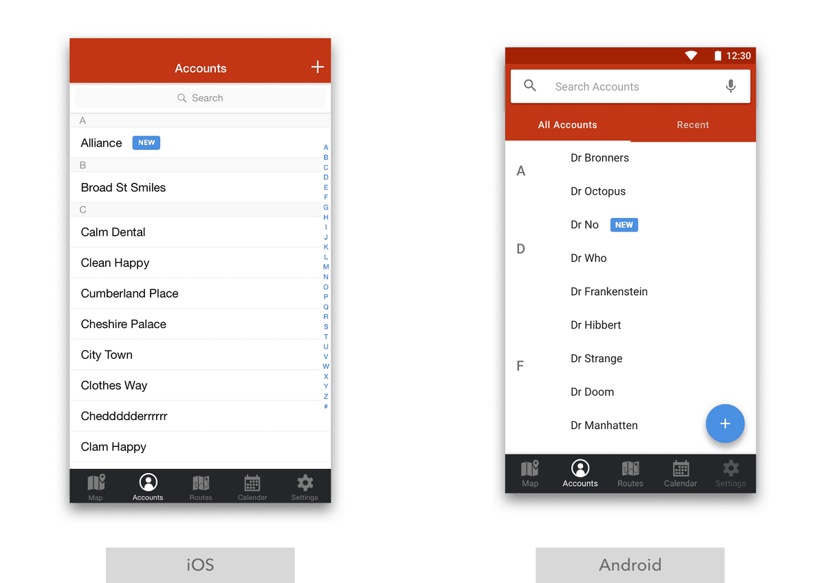 Differences between the account list screens
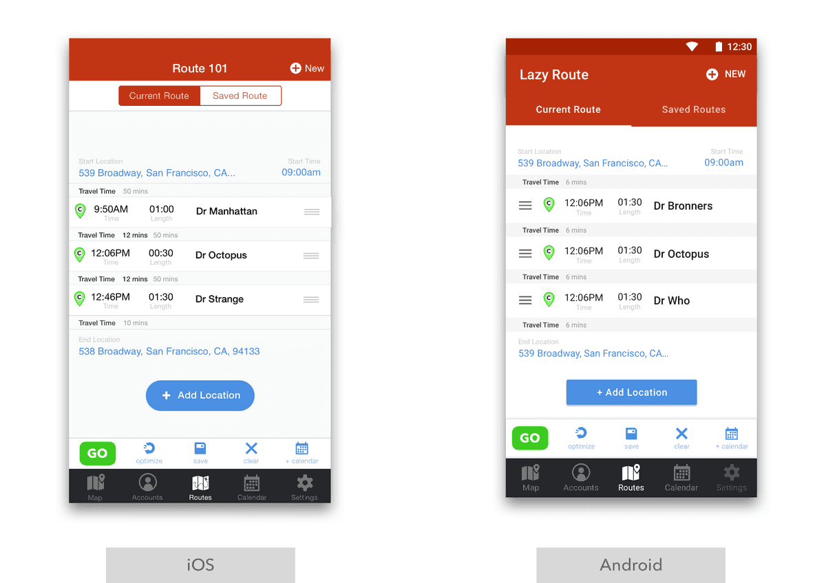 Differences between the route list screens
The goal was a application that worked like the iOS application, but felt home on Android. I think we nailed it.
Logo
After having been at Badger for a few years, a number of things bothered me about the logo. It was originally purchased from a website similar to 99 Designs to get the job done. While conceptually very cool (combo of a Badger and map pin) and having some good bones, the logo was hastily completed and it showed. I wanted to massage the logo to get it to the point where it felt more strongly designed.
A few goals I had:
- Make the logo look like it flowed. The curves of the current logo lacked harmony and didn't have a sense that they knew where they were going.
- Make it bolder. I wanted to be able to flip the logo to a black and white form (sans the red interior) and for it to still feel strong. With the original, the thin lines made the logo look strange and incomplete in black and white.
- Make the logo more consistent and balanced. The structure and lines of the original looked almost lopsided and had abruptly ending structures in it. The lines themselves were also not consistent widths without any reasoning to them.
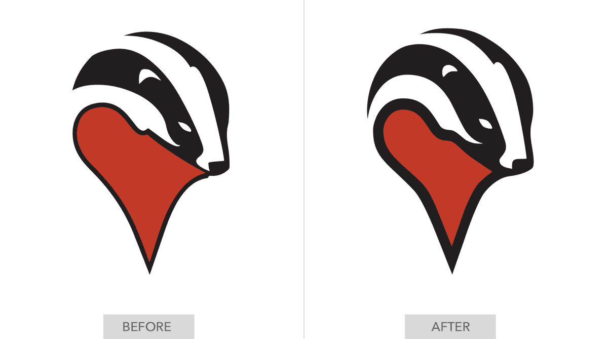 Thicker lines reduce better, curves flow in harmony, logo overall feels more 'designed'.
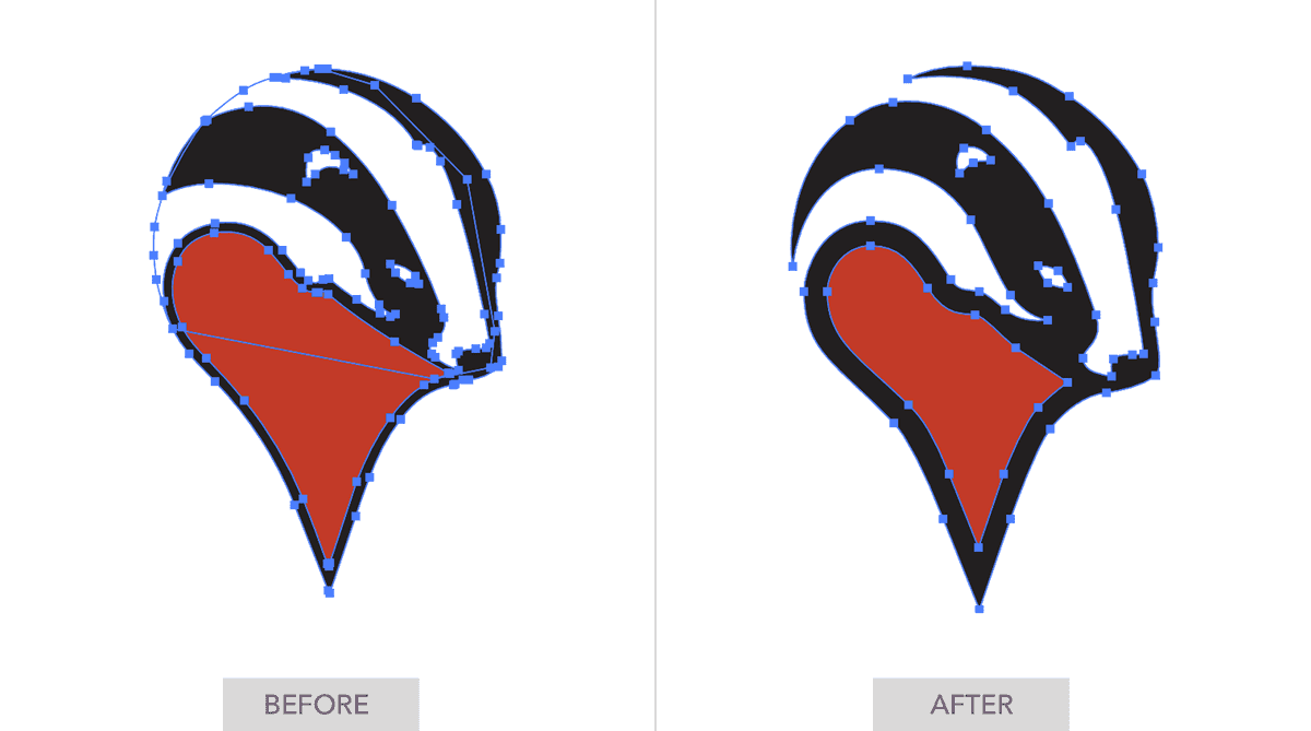 Point reduction, simplification, and consistency makes for a technically easier to work with product.
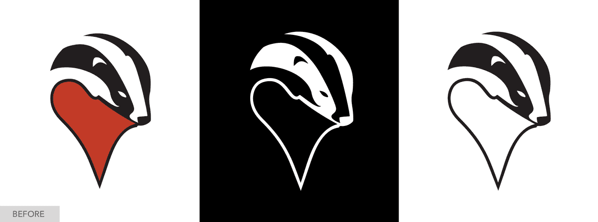 Original versions highlighting problems when going black and white
 Improvements in being able to go black and white
The resulting logo, to me at least, is a massive difference. It reduces FAR better. it feels more confident, it flows. it feels like it knows what it's doing.